CCTV3 VARIETY CHANNEL
ICONIC 3
Brand Energies were tasked by CCTV to refresh the onscreen branding of their hugely popular Variety channel; to better represent its mainstream audience and reflect its broad range of Arts-focussed programmes. With the idea of Variety firmly in mind, we were inspired by the famous and long-running print advertising campaign for Absolut vodka, which saw the distinctive bottle shape painted, constructed, deconstructed or decorated in dozens of memorable photographic images. We wanted to do the same sort of thing, with the same level of stunning execution and variety but as 10 seconds moving sequences - all featuring our newly designed, curvy iconic 3.
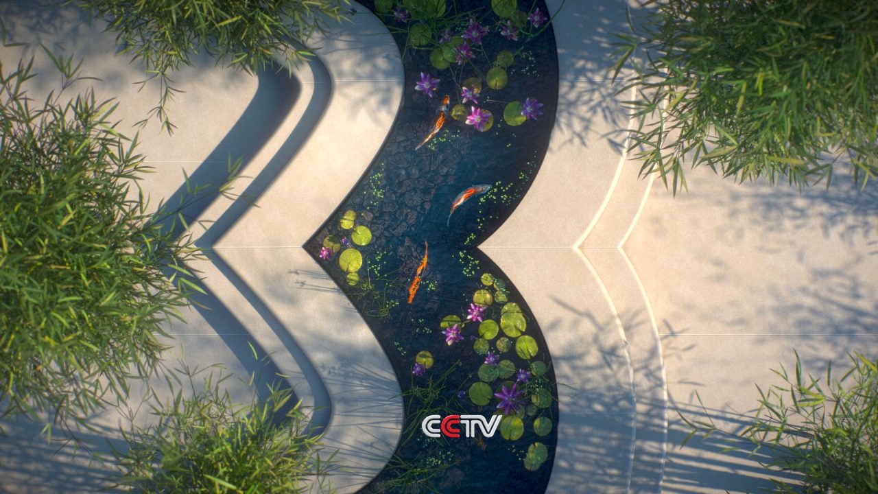
Each ID represents different aspects of the channel’s personality. They conclude with the iconic 3 filling the centre of frame from top to bottom, with the CCTV network logo appearing at the bottom of screen to create a consistent channel icon/network logo brand signature.
The first of these to go on-air is our Koi Pond ID; a beautiful realisation of the new 3 logo in the form of a tranquil garden pond.
Whilst it is not the first time BE has branded a channel using its logo with different materials and looks, nor indeed created a filmic spot featuring Koi carp, we are really proud of the atmospheric and super-realistic way in which these fish have been rendered; gracefully leading the viewer through the channel logo scene. Watch out for more 3s to come!


